ShopDreamUp AI ArtDreamUp
Deviation Actions


Suggested Deviants
![Tic Toc Griffin Shimeji - Sitting [WIP shimeji]](https://images-wixmp-ed30a86b8c4ca887773594c2.wixmp.com/f/c1137bc0-db96-4fd7-a8a9-626eca7a4e12/dbjw558-105a5ce5-5220-49aa-8209-86064c16acc9.gif/v1/crop/w_92,h_92,x_17,y_0,scl_0.24731182795699,q_85,strp/tic_toc_griffin_shimeji___sitting__wip_shimeji__by_cachomon_dbjw558-92s.jpg?token=eyJ0eXAiOiJKV1QiLCJhbGciOiJIUzI1NiJ9.eyJzdWIiOiJ1cm46YXBwOjdlMGQxODg5ODIyNjQzNzNhNWYwZDQxNWVhMGQyNmUwIiwiaXNzIjoidXJuOmFwcDo3ZTBkMTg4OTgyMjY0MzczYTVmMGQ0MTVlYTBkMjZlMCIsIm9iaiI6W1t7ImhlaWdodCI6Ijw9MzcyIiwicGF0aCI6IlwvZlwvYzExMzdiYzAtZGI5Ni00ZmQ3LWE4YTktNjI2ZWNhN2E0ZTEyXC9kYmp3NTU4LTEwNWE1Y2U1LTUyMjAtNDlhYS04MjA5LTg2MDY0YzE2YWNjOS5naWYiLCJ3aWR0aCI6Ijw9NjQ0In1dXSwiYXVkIjpbInVybjpzZXJ2aWNlOmltYWdlLm9wZXJhdGlvbnMiXX0.zpNX0XLfPkPsVH2-pROa4TUKIZ6RAXQEiH7caukYp8s)

![Roy the Raichu Shimeji - Stand [WIP Shimeji]](https://images-wixmp-ed30a86b8c4ca887773594c2.wixmp.com/f/c1137bc0-db96-4fd7-a8a9-626eca7a4e12/ddydbqt-a46a55a9-7d1e-4cdb-9512-ddf9bf539026.gif/v1/crop/w_92,h_92,x_16,y_0,scl_0.23711340206186,q_85,strp/roy_the_raichu_shimeji___stand__wip_shimeji__by_cachomon_ddydbqt-92s.jpg?token=eyJ0eXAiOiJKV1QiLCJhbGciOiJIUzI1NiJ9.eyJzdWIiOiJ1cm46YXBwOjdlMGQxODg5ODIyNjQzNzNhNWYwZDQxNWVhMGQyNmUwIiwiaXNzIjoidXJuOmFwcDo3ZTBkMTg4OTgyMjY0MzczYTVmMGQ0MTVlYTBkMjZlMCIsIm9iaiI6W1t7ImhlaWdodCI6Ijw9Mzg4IiwicGF0aCI6IlwvZlwvYzExMzdiYzAtZGI5Ni00ZmQ3LWE4YTktNjI2ZWNhN2E0ZTEyXC9kZHlkYnF0LWE0NmE1NWE5LTdkMWUtNGNkYi05NTEyLWRkZjliZjUzOTAyNi5naWYiLCJ3aWR0aCI6Ijw9NjU4In1dXSwiYXVkIjpbInVybjpzZXJ2aWNlOmltYWdlLm9wZXJhdGlvbnMiXX0.ZlI-A3ITTHLgmtePYYSQJ9pCuCqogd3OhjKYndopVcg)
Suggested Collections


You Might Like…


Featured in Groups


Description
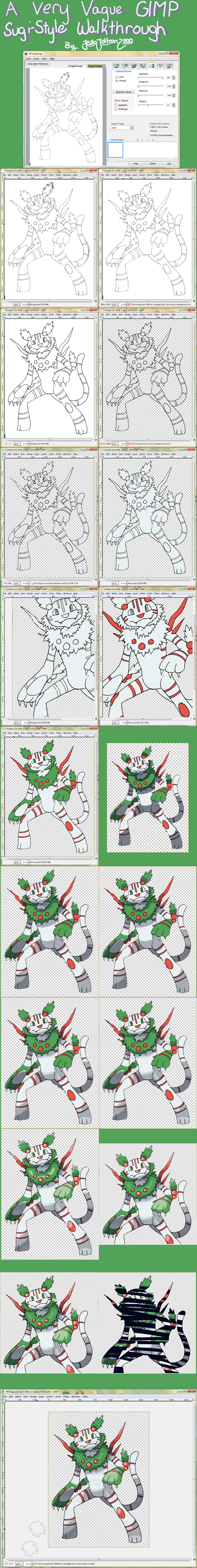
Here's how I make my Sugi-styles using GIMP! What you'll notice is that the words are down here, and you are going to need them to do this. I'll try to explain everything as best I can!
For this tutorial, I used my HP Scanner (optional, but good and easy for making believable lines), a black Sharpie pen (Again, optional, but it works quite well for this purpose), a Bamboo fun tablet, and, of course, GIMP.
In GIMP, I made heavy use of layers, opacity, and erasers. It is important that you know how to at least make new layers, and It's also important you know where to change the opacity on both brushes and layers. Hopefully, I can explain this well enough that you don't need to know much else outside of that. If you need any questions answered about this tutorial, don't hesitate to ask! I promise not to bite and I'll answer what you're asking to the best of my ability.
Good luck!~
1. (Not Pictured) On a piece of computer paper, draw a sketch of your desired fakemon. As far as size goes, the sketch should be around 4 or so inches in its longest dimension. Using a black pen of some sort (I use a Sharpie pen, which works well), carefully ink this sketch. Try your best not to screw up- that is, close all your lines, make sure you don't have lines that run through each other (as in there are little nibs on the other side of a line where there shouldn't be), and try not to make any otherwise major errors. This makes it so that when you're cleaning up your lines in GIMP, you have less to do. If at all possible, try to make the lines that make stripes, spots, or otherwise non-form lines (such as the weird lines on Zekrom) slightly thinner. It adds effect. Also, if you intend to use perspective, make the in-question areas slightly thicker as far as lines go. Once you have finished your line art, carefully erase your sketch. Again, this should save some grief later.
2. Scan your image into GIMP (In newer versions, File>Create>Scanner/Camera. In older ones, it was something like File>Acquire from...>TWAIN) When you get the chance to edit the image to be scanned, you'll want to make the output size in the neighborhood of 1700-2300 pixels, dependent on the size of the fakemon you're doing. You also will want to lighten/darken the highlights, shadows and midtones: Highlights should be at 100, and Shadows and Mitdones at -100 . Leave the Gamma alone if that option exists. When you've finished, press okay/scan/whatever button will proceed to create for you an image.
3. Now that you've got your image scanned in, you should clean up any areas on the lineart that aren't overly neat. In this step, you'll mostly just be using the eraser.
4. Once you have any glaringly obvious things fixed (i.e. on my fakemon Wintiger, the holly on the ears and the tail), you are ready to apply the cartoon filter (Filters> Artistic> Cartoon) A little screen will pop up, and you will want the Radius to be at its maximum of 50, and the percent black at around .612. A special thanks to =renardchaton for this lineart process! However, I like to do something a little extra to mine.
5. Select an area of black on your lineart by color, so you get pretty much the entire lineart. There may be some weird spots of color or gaps of some sort, which we will at least attempt to fix. Once selected, you will want to Grow selection (Select> Grow) by 1 pixel, and then Shrink the selection (Select> Shrink) by 1 pixel. It's important that you do it like that because it will pick up gaps, but then shrink the selection back to its original thickness. Make a new layer, keeping your selection, and use the bucket tool (or drag and drop from the little foregroung/background color squares) to fill with black. Merge this layer down and deselect. If you have any gaps in your lineart like I did on Wintiger's front leg, now is the time to use a pen tool around 7 pixels (I also like to enable the hardness pressure sensitivity option) to fill in these areas.
Now, with everything cleaned up, we can make transparency happen. Go to Colors> Color to Alpha... and when the screen pops up, make sure that it is set for white (#ffffff, not any off-white) and hit OK.
6. We are now ready for color! Select, using the wand tool, any areas that you will want to NOT be colored when you are finished. This is the area around your fake for the most part, though there may be some areas cut off from this, such as the gap between inner arm and the body, so don't forget to select these, too. Once everything you want is selected, Grow the selection by 2 pixels, and then invert it (Select> Invert). Create a new layer BELOW the lineart, and use the bucket tool to fill in your base color- the color that your fakemon is mostly. Alternately, if the colors are about equal in use, then pick the color that would be harder to color in under normal circumstances. Usually, this happens to be the base color anyhow.
7. Deselect after filling the base color in. Go back to the lineart, and select using the wand tool any areas of the same color (e.x. Wintiger's stripes and berries). Grow this selection by 2 pixels and on a new layer, fill in that color. Repeat this process, including the creation of a new layer, for as many colors as you have. This makes it easier to create a shiny version later. Layer order can be important and should be left up to your discretion. Sometimes, such as on Wintiger's eyes, it is easier to just put a layer below and color everywhere in a larger region than trying to select smaller ones.
8. We are now ready to shade! Select your base color (This is also why it helps to make all the colors on different layers), and Create another new layer, on top of all color but below the lineart. Set this layer to 50% opacity because it makes it easier to see what you're doing. Pick, under most circumstances, a very dark, highly saturated blue, such as the color #03071d, though this does not need to be exact. Just in the general ballpark. Color in your shading; the idea is to color more than you will need because we are erasing the edges of it.
9. Once you are satisfied with what you have shaded, duplicate this 50% layer. Change the opacity of BOTH layers to 29%. Two layers at 29%, as you might notice, is almost the exact same (if not the exact same) as one layer at 50%.
10. On one of these layers, (it doesn't matter which layer) use the eraser at 100% opacity (By the way, you should not be using all of the presets on this eraser at the moment, though you may wish to scale the eraser to a larger size for ease of use) to trim the shading down to only the darkest parts. I'll refer to these areas as double-shading. Once you've done that, you can switch the eraser down to 50% opacity. At this point, you will want o erase in either lines (e.x. Wintiger's back foot) or wiggly patterns (such as Wintiger's tail or leaves). Go over the areas 2 or 3 times like this. Straight lines are used for flat surfaces, and wiggly lines are for less flat ones. You are allowed to be kind of messy with these as that's what gives the shading its uniqueness.
11. Using the same technique as you did on the double-shading, erase the edges of the other 29% layer's shading. You should use straight lines (as in, they follow the contour of the shading and do not wiggle) most of the time. For a good example, see Wintiger's front foot. When you do this shading, you should erase once to get the contour, and then erase the very edge of this new area to make the shading appear slightly fuzzy. Some areas can also have chunks taken out of their shading (see Wintiger's stomach area) for added effect.
12. On the non double-shade layer, get the fuzzy circle brush for the eraser and put it at 10%. In the areas farthest from the light source, erase once or twice. If you wish, you can smudge the edge of this area using the smudge tool at a rate of 75. Use zig-zag motions, alternately pulling in and out on the patches.
13. Create a new layer, this one with 50% opacity. You will now be doing the highlights You will want to get a very light yellow color (such as #fffef4, though again, this is just a ballpark). Using this color, make circular patches of highlight. On flat surfaces, like the shading, make the lines straighter.
Again, using the eraser (back to the normal circle brush and 50% opacity) erase away at the edges of the shading. These will ALWAYS have wiggly edges, and they more often then not have stringy tails. To get this tailed effect, erase away at the sides of your patch of highlight.. The best, most visible example of this on Wintiger would probably be its left forearm.
14. Create yet another new layer. This time, however, it should be on top of your lineart, especially if your eyes have shine to them. Using a small paintbrush at 50% make tiny patches of light on various areas of your highlight. Go roughly over the same spot 3 times using the yellow from your highlight layer. For things like jewels or eyes, go over these areas 4 or 5 times. Not every highlight will have these, and no highlight should have more than one.
15. Almost done! Using the same color you used for shading, create a new layer and use a paintbrush to paint some lines all across the fakemon, leaving areas of plain color. Once satisfied, reduce the opacity of this layer to 3%.
If you have areas with other textures such as the leaves on Wintiger, you can make a new layer, select said regions, and repeat the process using a different brush. Instead of making lines, however, you will just want to dot these areas. Experiment with different brushed to find the texture you like!
16. You are done! SAVE YOUR WORK IF YOU HAVEN'T ALREADY! (You really should save often, as I know GIMP likes to crash) WHen I save my Sugi-styles, I first save a .psd version, then I save a .png copy, and finally I edit the colors for a shiny using either the Colorize or Hue/Saturation filters. (Which I of course save when I'm done. I save shinies in .psd format. For the record, .psd can be replaced with .xcf, gimp's native file format, as it too saves layers in case you need to edit something.)
I then like to open the .png (Best way: open recent) and scale it down (Image> Scale image) to about 33%.
And I'm done! You are then free to do what you want with your beautiful Sugi-styles. I hope this has helped you, and happy styling!~
BONUS: If this tutorial has helped you, link me to your art in the comments! I'll try to leave a comment of some sort and I would love to see what you come up with.
Pokemon © Game Freak, Sugi style © Sugimori, and Wintiger, Art, and Tutorial © Me.
Image size
1004x8000px 4.42 MB
© 2011 - 2024 JelloJolteon2000
Comments150
Join the community to add your comment. Already a deviant? Log In
what if i dont have a scanner?